Thursday, December 10, 2009

Environmental Photo

.

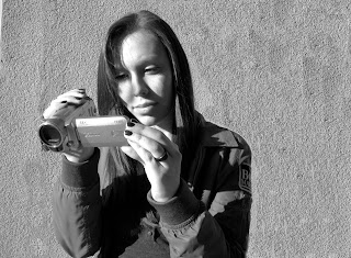
For my Environmental photo I chose to use Nery videotaping since her major at scpa is video production. The objects in the picture are Nery herself, the video camera, and the background was originally the wall with bushes outdoors but with photoshop i was able to remove the bushes and put the focus more on nery and her required environment. I put this picture in blank and white because the lighting appeared stronger to nery in black and white. I also chose to take the picture close up and further to the left because the picture would not be as strong centered. The tone of this photo is based on concentration and how its required with nerys environment. Though this photo is a bit simple i felt its right to the point rather than showing what Nery is actually filming since the photo is supposed to be based on her.

Tuesday, December 1, 2009

Yellow Boat Photo


reflection: For my yellow boat photo the objects in the picture are viviana and the trees and hill in the background. I chose to use a dirty glass to put in front of viviana so that the picture would have an overall sad somewhat shriveled or disappearing mood. Aids depending on the person can be a depressing feeling. This photo was taken outdoors and i had a bit of a hard time using the reflector without seeing me in the photo. The colors are sort of fall colors because of the trees and the hill and viviana's choice of wardrobe helped give her more of the focus. Her red headband what viewers may not recognize is suppose to indicate the color of aids itself.

Thursday, October 22, 2009

senior exhibition test shot

Reflection: For my senior exhibition test shot of graffiti there are many objects shown in the picture. If you look closely you will see a variety of things expressed in this image including a skull, a mexican or aztec man, a fetus, a deer, bubbles with objects inside of them and letters. This picture is very abstract. The shapes in the picture are shown through the objects themselves the skull is very circular as well as the fetus image and the lettering also portray the shapes. The image was intentionally put well in focus to get a good image on how specific each object idealizes. I feel the image is both dark and light in different ways and since it is in black and white it gives a feeling of different shades of gray. This image was taken outdoors on a building so other people can see that the setting in which this photo was taken portrays the lives of those who live there. I feel that i was somewhat successful with this photo i feel one of my other pictures could have given a better message but i like that this gives different feelings to those who see it. I felt a bit rushed when choosing my final picture since it was not taken with a digital camera and i had to spend a lot of time developing.

alter ego


Reflection: For my alter ego photo i wasn't sure what i wanted to do. The objects in this photo that make the photo my alter ego are the fake knife, heels, and the tights. The picture is taken somewhat far away so that i could be able to paste one photo onto another. The knife gives the feel for the element of design of a line. The photos are a bit blurry which was accidental but i made an effort to adjust it in photoshop. The pictures of myself are a bit dark and the background appears very bright. This photo was taken indoors. I tried to make myself look like the same person but a different personality. I feel with this photo i could have done a lot better but it took me a while to find the idea that i wanted. I did not have very much time to take photos either since the backgrounds had to match. Originally i wanted footsteps walking towards each other behind me making it seem as though i was approaching my alter ego. I feel as though i focused too much on making my picture work rather than just letting it flow together. And i think the audience would have understood my alter ego better if it was not in black in white,but if i would have done it in color it would have looked really fake.

Monday, June 15, 2009

Maya Angelou Quote

Nature has no mercy at all. Nature says, "I'm going to snow. If you have on a bikini and no snowshoes, that's tough. I am going to snow anyway."

Friday, May 22, 2009


Season Picture

Reflection: For our season project i chose to use ericka gonzalez as my model. My season that my picture was suppose to represent was winter. I had her wear a fur jacket and her hood to get more of a wintery feeling and the stamps from photoshop that i used were snowflakes and a butterly looking design. I used cool colors to make my season stand out. Our assignment was to learn to use color plates and at first i was having difficulties following the photoshop directions but then i figured out were some of the tools were. My model was a really good model to use for intense looks her facial expressions worked really well with my picture

Monday, April 13, 2009

Monday, March 23, 2009

Line


Texture


Color


Saturday, January 31, 2009

self-image


Reflection:
For my self image project i chose to use a background from flickr.com. I chose my background to be black with a splash of reggae colors to blend in good with my picture which i split into three colors red,yellow, and green. I used different layers to put text and to paste my original picture onto my background picture. I feel i learned a lot more about photoshop than before i did this project.

Wednesday, January 21, 2009

Fashion Project


Reflection:For our fashion project i used Jasmyn H. as my model. When i did her make up it came out really good but it wasnt very noticeable in the pictures as i thought it would. I chose different poses similar to magazines and Jasmyn was able to perform the poses very well. I felt that I do better with my camera but for this project i used ms. miles camera and strobe lights. The strobe lights made a big difference with the pictures. I felt my pictures colors could have come out better if i had developed them a little better